Most photographers use about twenty percent of what their editing software can do. These three tools are almost always in the other eighty.
There are three tools I use on almost every edit. They aren’t complicated. They each do something the obvious sliders can’t, and used with restraint, they add something to an image that’s very hard to get any other way.
Tool one: Vignette
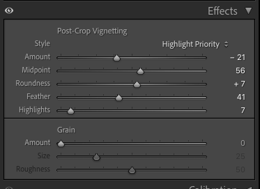
A vignette darkens the edges of the frame, drawing the eye towards the centre. It is one of the oldest techniques in photography, used in the black and white darkroom long before it became a software slider. Photographers would burn in the edges of a print to give the central subject more visual weight.
The digital version does the same thing with considerably less effort. In Lightroom it sits in the Effects panel. In Capture One it is in the Vignetting tool. The principle in both is identical.
The one thing to be careful about is overdoing it. A heavy vignette looks fine on screen at full size, but on a small image, a thumbnail or a social media preview, it can look exaggerated and crude. The effect gets amplified as the image gets smaller. Always check how it reads at a reduced size before you decide the amount is right.
Used subtly, a vignette is almost invisible. The viewer does not notice it. They just find themselves looking exactly where you want them to look.
In Lightroom
Use the Post-Crop Vignette in the Effects panel rather than the Lens Corrections vignette. The post-crop version respects your crop and applies the darkening to the edges of the final image. Keep the Amount between -10 and -25 for a natural result. The Feather slider controls how gradually it falls off. Higher feather values are almost always more convincing.
Tool two: Dehaze
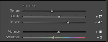
Dehaze was designed for landscape photographers dealing with atmospheric haze. Most portrait and commercial photographers assume it has nothing to do with them. That is a mistake.
What the Dehaze slider actually does is increase contrast in the midtones specifically, while simultaneously boosting colour saturation. It is a targeted punch, not a blanket adjustment. And that makes it very useful on portrait and branding work, particularly images shot at high ISO.
High ISO creates a kind of visual flatness. The image can look technically fine but slightly lifeless. A small amount of Dehaze, between +10 and +20, recovers the sense of depth and presence that the noise has taken away. It works in a way that Clarity and Contrast do not quite replicate.
The important word is sparingly. Too much and skin tones go harsh and the image starts to look over-processed. A little goes a long way.
In Lightroom and Capture One
In Lightroom Classic, Dehaze sits in the Basic panel, in the Presence section, between Clarity and Vibrance. In Capture One, the equivalent is the Clarity tool set to Natural or Punch mode, which targets midtone contrast in a similar way. Start at +10 and increase slowly. Watch the skin tones. The moment they start to look rough, pull back.
Tool three: Colour grading
Colour grading is where editing becomes genuinely creative. It is also where most photographers either avoid it entirely or go too far and create something that looks like a filter rather than an image.
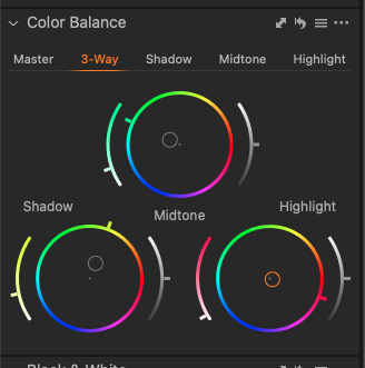
The tool works by allowing you to push colour into specific tonal ranges. Highlights, midtones, and shadows independently. A warm tone in the highlights and a cooler tone in the shadows creates a cinematic split that adds depth without looking processed. A subtle push towards a client's brand colour in the midtones creates a consistency across a set of images that ties everything together.
That last point is the one most people miss. For branding photography specifically, colour grading is not about making images look cinematic. It is about making them look cohesive with the brand. If a client's palette is warm terracotta and cream, a slight warmth in the midtones pulls the whole shoot in that direction without altering the exposure or the basic colour balance.
Understanding the colour wheel helps here. The opposite of a colour on the wheel is its complement. Pushing highlights warm and shadows cool, or vice versa, creates the kind of tonal separation that makes an image feel three-dimensional. It is worth spending ten minutes with the colour wheel before you start grading a new client's work.
In Lightroom and Capture One
In Lightroom, Colour Grading replaced the old Split Toning panel and gives you three separate colour wheels for shadows, midtones, and highlights, plus a global wheel. In Capture One, the Colour Balance tool does the same job with the same three-way split. Start with the midtones wheel and make very small moves. A shift of 5 to 10 on the hue is usually enough. More than that and the effect becomes visible rather than felt.
None of these tools are hidden. They are all sitting in the same panels most photographers open every day. The difference is using them with a clear intention rather than reaching for them when something looks wrong.
That is the edit that holds up.
Which of these three do you already use, and which one are you going to try first? Email me at marcus@marcusahmad.com and let me know.
Want to go through your own edits with me? A Power Hour covers exactly this, on your photos, in your software:
This post first went out to newsletter subscribers on 17 September 2026. The podcast, the YouTube channel and everything else are in one place: linktr.ee/MarcusAhmadPhotography